Because I have been considering doing some hand rendered type for my sin city poster I wanted to look at the current identity type and how I could create something alternative to this.

The type above and below is both the comic book and film title typography. The way the letters so clearly connote brush strokes has a strong visual connection to the well established comic book aesthetic. the film is very heavily based on the comic and the use of this type helps communicate this to audiences. the crudeness of the shapes also communicates something of the genre of the film; high action and violence.


Of course It wouldn't be complete without looking at the hand drawn lettering within such a comic. The softness of the hand made letter forms allow the images to dominate the page when the crisp lines of digital type would have drawn attention. The words are shaped to fit the allocated space rather than the other way around and most of all the clear connection they have to a human hand gives the sense that we are being told a story by someone, bringing the narrative closer and the emotional evocativeness of the piece is increased.
For my text I want to create a similar effect but with less of the restraint of being tied down to the comic. the idea of crudeness is something I want to play on by possibly looking at heavy ganster-ish type that is quite dominating and brash. However, I also want to look at communicating something of the essence of the film, possibly the sadness of a decrepit and corrupt city. This could be done by taking something traditional and quite refined but then defacing it, maybe by splattering white ink all over it like in my early ideas.
This is something that caught my eye on type and everything. It's much more on the refined side and would suffer quite a lot from being defaced but perhaps it would work.
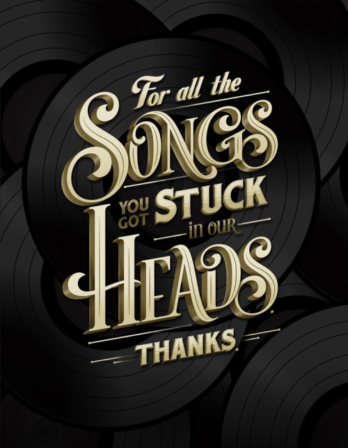
This has slightly more of the heavy gangster look to it that i wanted but has the added extra of looking quite a lot like an old film font. Combining something of the essence of the film with almost a hint at its story and look; it is a lot like older films with its established protagonist narrative and strange parallel of the film noir style.

This is almost a combination of the to with the softness of the first and the gravitas of the second, perhaps this is closer to the direction I want to go in.
No comments:
Post a Comment