The Comic look is based majorly on block primary colours and the mix of very flat images and illusions of depth. The extreme three dimension type shown below is something that I really want to incorporate into the box cover designs, possible on the title.

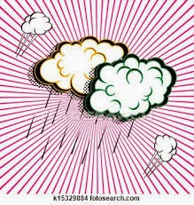
The dotted texture shown below also screams comic book and is something we also want to incorporate, how to do so should become apparent as we start designing it.

The rays of red sunlight like graphics are something that not only looks like something from a comic book but also blurs with the look of funfairs, which so often make use of stripes of white and another primary colour.
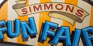
One think we found that define the funfair aesthetic was a mix of fonts. we hope to achieve this by using 4 different fonts on the inside of the box and another different font on the top of the box.

Something I definitely want on the front of the box is the ribbon banner that really looks like something found at a fun fair giving our project a sense of wonder like it would be in the believe it or not tent, something new and exiting.
No comments:
Post a Comment